Caak
A Social News Platform
Caak, once a major news site in Mongolia, has transformed into a social news platform that tailors news delivery to users' interests. This ensures a personalized experience aimed at delighting its users.
Summary
Caak is a SaaS platform accessible from any device (iOS, Android, Web), allowing users to earn revenue by posting compelling news.
Timeline
May 2022 - August 2023
Team
Application Engineer, Project Director, Product Designer (Me)
Tools
Adobe XD, After Effects, Figjam, Protopie, Lottie
Design Principlines
Design thinking process
My Role
Product Design, Branding
The Impact
I led the entire design system for this project and conducted user research.
Problem
How it all started
Every day, the average person in Mongolia spends around 15 minutes catching up on the news in their busy lives. Mongolia has approximately 98 news agencies, each sharing news through their programs. However, it's often hard for people to find the most important news, as many outlets focus on negative stories. This can leave people feeling confused and might even make them think about changing their lifestyles.
Caak wants to solve this problem by offering positive news and content that users can customize based on their interests, like hobbies.
Goal
- To create a platform where news could be provided and discussed, incorporating diverse perspectives.
- The App User Interface must be consistent across all devices since users may visit from any device.
- To establish a revenue system based on content performance.
- To provide news tailored to users' interests.
Research
Design Process
To begin with, I used The Design Thinking Process for this project. This method proved to be the most effective way to comprehend users' pain points and enhance the product.

Empathizing with Users
I did research with online (Maze) to gathering user's pain points, lifecycles, and opinions.
The Results
84% of people at the event like to find the newest and most important news every morning.
1. Weekly News
People who are pressed for time often appreciate reading a quick weekly news roundup.
2. News Quality
People are drawn to news articles by their images and titles, often finding themselves ultimately reading Sponsored content.
3. Well-Organized News
People are struggling to find news related to their hobbies and interests from multiple sources.
Personas
Basing on the insights of evaluations i created Personas to find deeper insights.

P.Tuhai 28
Residing in the countryside, she is constantly on the lookout for fresh news. While she checks the news daily, managing through thousands of news sources proves challenging. At times, she finds herself bookmarking news articles to serve as reminders.
Needs
・Read news from multiple agencies in one source.
・Bookmark any content for creating and making things.
・Seek more news based on her interests.
Pain Points
・Reading news from multiple sources but is struggling to switch tabs to find news.
・Using the web browser's bookmarks and an extension to save useful content.
・Lack of resources to read news with interests.

E. Beltechu 42
He thoroughly enjoys commenting on news to engage in discussions with others. His routine involves checking comments and briefly reading news, as some news tends to be inaccurate.
Needs
・Reading true news
・Enjoying a content more with comments
Pain Points
・Hard to find true news, because of sponsored news.
・There isn't sufficient room for discussions with someone on every website and app.
Solution

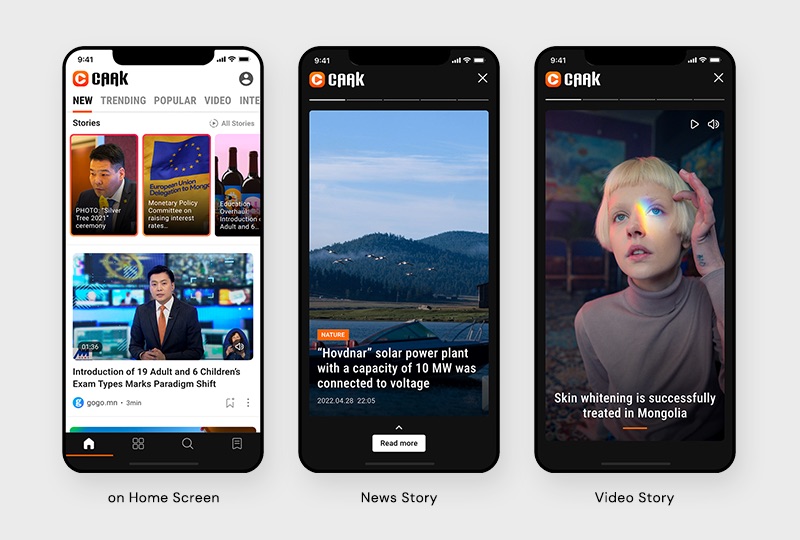
1. News Stories
It is a new feature to provide news on days and weekly with compact information and fun.
Benefits: Fun, Compact, and to receive concise news weekly.

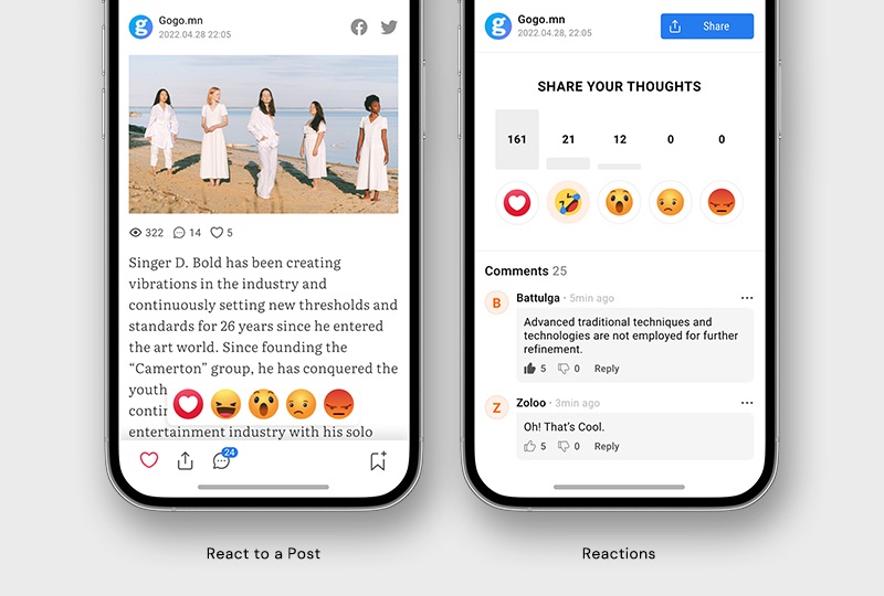
2. Bringing Emojis instead of Comments
Emojis are expressive symbols that facilitate a quick understanding of the news condition. It seems like there's a small error in the sentence. And it triggers other visitors to express their feelings about the content.
User Validation

Due to the time constraints, I made some mid-fi prototypes to test 6 external users who like to read news. Our testing purpose emphasized on discovering usability issues and context of use.
Key Findings from the Participants
- When users visit the app's home page, they desire to view additional news in a limited space.
- The all-stories page is too cramped, and they do not wish to see news from previous months.
- Users prefer saving articles for later use rather than reacting to them.
- They prefer reading related messages instead of browsing through comments.

Iteration Based On Research Finding
After testing the lo-fi prototype with real users, I adjusted design elements and the information hierarchy based on users' behaviors and decision-making process.
Iteration - Post Detail
- Too many emojis can make it difficult to understand the news sentiment. Showing the top two most-clicked emojis could work.
- Saving a post is hard to find. We adjusted the position of icons and color.

App and Dashboard Design
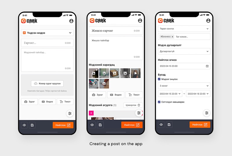
I designed the dashboard that is used for monetizing content for those who want to earn money by creating articles.


The Impact
Renewing the website and creating an app for it has proven successful. Reacting to posts with emojis has increased user engagement by 200%, indicating a strong preference for this interactive feature. Additionally, featuring stories in the news section has become more prominent, shifting focus from listed news. Currently, we are gathering user feedback and to get sessions with Hotjar, and 98% of voters express positive opinions.
