Lexus Membership
Digital Magazine
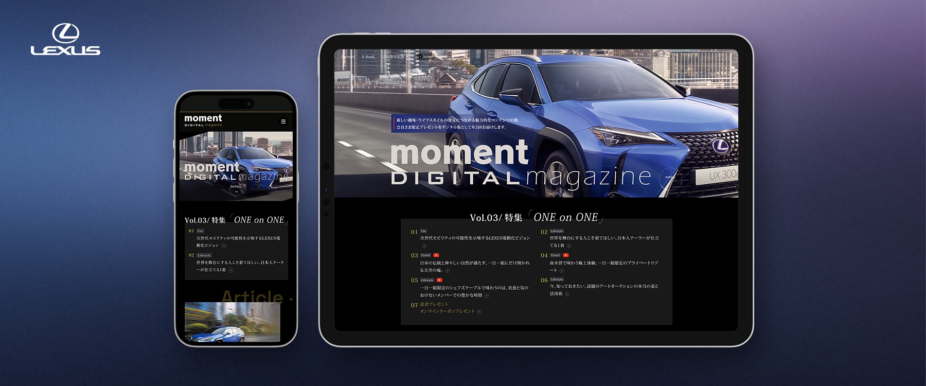
Moment Digital Magazine is an exclusive publication for Lexus Card members, delivering captivating lifestyle content and the latest information to enchant Lexus owners.
Summary
It is a huge project with plenty of subpages and landing pages. So, I am going to show you just how the project all started.
Timeline
2021 - Present
Team
Front-End Engineer, Project Director, Visual/UX Designer (Me)
Tools
Adobe XD, Adobe Photoshop, After Effects, Figjam
Design Principlines
User Centered Design, A/B Testing
My Role
Visual Design, Web Design, Banner Design
The Impact
I led the entire visual design related to this project from end to end.
Goal
Lexus is a luxury car brand targeted at individuals with a sophisticated taste. The Lexus Card service is designed to provide advantageous information, campaigns, and exclusive gifts to those who hold a Lexus Card. Approximately 85% of our customers access the service through smartphones.
Therefore, our mission was to launch a website that embodies a sense of luxury, a digital magazine feel, and incorporates the distinctive taste of Lexus.
- Designing with a focus on being Mobile-First Ready.
- To convey the impression of a dedicated Lexus feature site used for clients and delight them.
Procedure
We basically used User Centered Design and A/B Testing to accomplish this project.
We gathered information about the user's background and daily life, then defined the problem to solve and generated ideas.
Design Iteration

The Analysis and insights
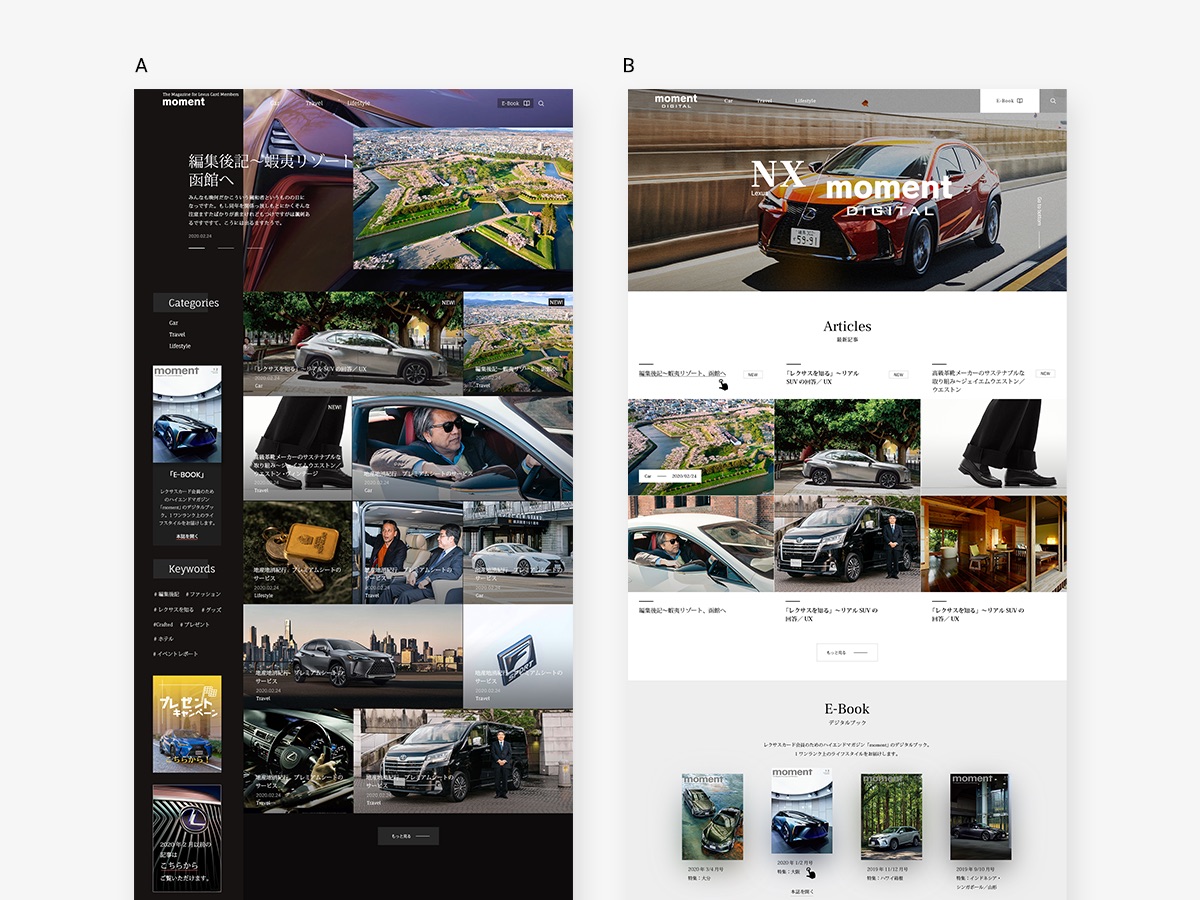
We created two types of top pages with black and white backgrounds, gathering information about usability and reachability from the initial design.
Problem
🔲 Too Monochromatic
During testing with end users, they did not feel particularly excited because the page was too clean, and the buttons were not easily accessible.
😵💫 Messy Pattern
We employed an container-free web pattern to create a unique feel for the digital magazine website.
However, it did not work well, some users were confused upon visiting, and scrolling to the next content took too much time.
Solution
1. We added a brand new color.
Gold is often associated with good feelings like warmth and happiness. This positive connection makes people see gold in a good light. So, when users interact with content or go to special areas using the gold color, it feels exclusive and special.

2. We changed the page layout and hierarchy to a single-column pattern for easier readability.
Each section's title is strategically centered to optimize accessibility, providing dual advantages.
Firstly, when adjusting the text alignment to either the left or right, a specific section becomes notably more readable.
Secondly, this centered format significantly boosts page scrolling and reading speed by 400%, enabling users to effortlessly consume a wealth of content within minutes.
This intentional design enhances the overall user experience and efficiency of navigating through the page.

The Results
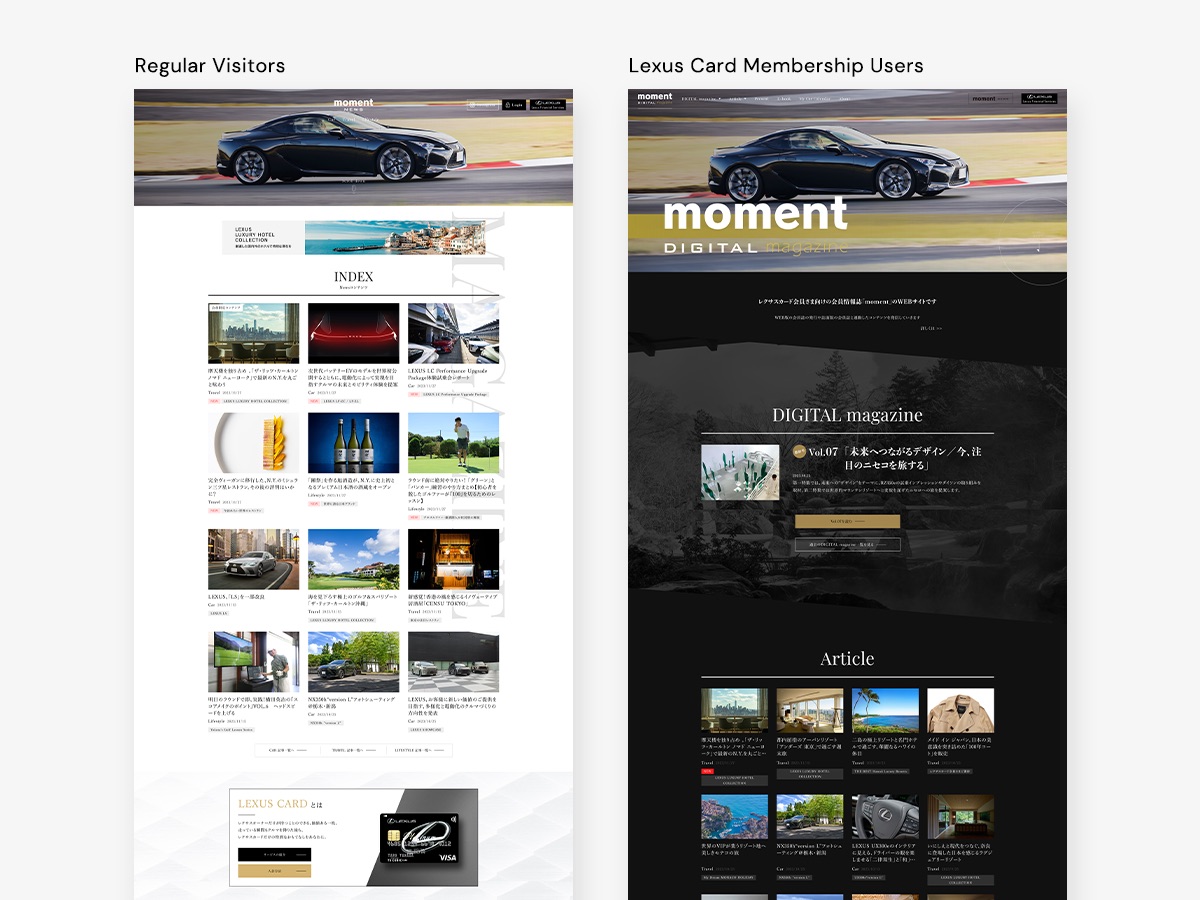
We successfully delivered an exceptionally satisfying digital magazine website. Currently, the site is integrated with thousands of Lexus websites and incorporates two distinct design languages for logged-in users and regular visitors. This allows real digital magazine users to enjoy more personalized content and receive additional benefits such as presents and tailored information.

