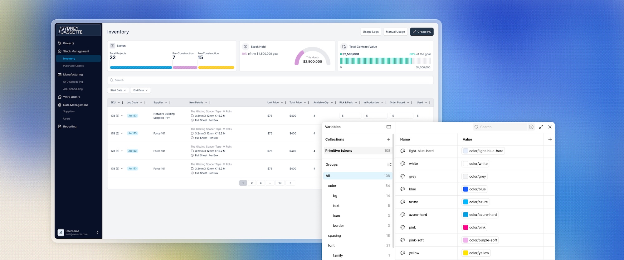
SYDNEY CASSETTE
SYDNEY CASSETTE is an internal operations and ERP web app that helps manufacturing staff manage purchase orders, inventory, and production scheduling.
Summary
This was a redesign project focused on improving the product's UX/UI. I led the initiative end to end, building a brand new design system, including components and variables, alongside the UX/UI improvements across the web app.
Timeline
June 2025 - July 2025
Team
Software Engineers, Project Director, UI/UX Designer (Me)
Tech Stacks
Figma, Shadcn, Polaris
Design Principles
User Centered Design
My Role
Design System, Web App Design, UX Improvement
The Impact
I conducted user interviews and gathered feedback from the client side to identify the core problems, then resolved the complex UI/UX issues across the web app.
Problem
As the internal services expanded, the app accumulated a lot of inconsistent changes over time. Without a unified design language, the interface became cluttered and hard to navigate, making it difficult for staff to find what they needed.
Goal
The goal was to make the web app easier to use by reworking the color palette, redesigning the overall layout, and updating typography across the product.
Solution
I built a new design system, including reusable components and variables, so the product could scale consistently as the business grows and future features could be designed faster using the same foundation.
Process
I started with a single token base, rebuilding color, spacing, typography, and border styles from scratch and organizing them into clear categories. On top of that, I rebuilt 20+ components as variants, keeping each one lean with no excess so the system stays fast, and wrote a usage guide for every one of them. From there, I designed a full set of pages using the new system.
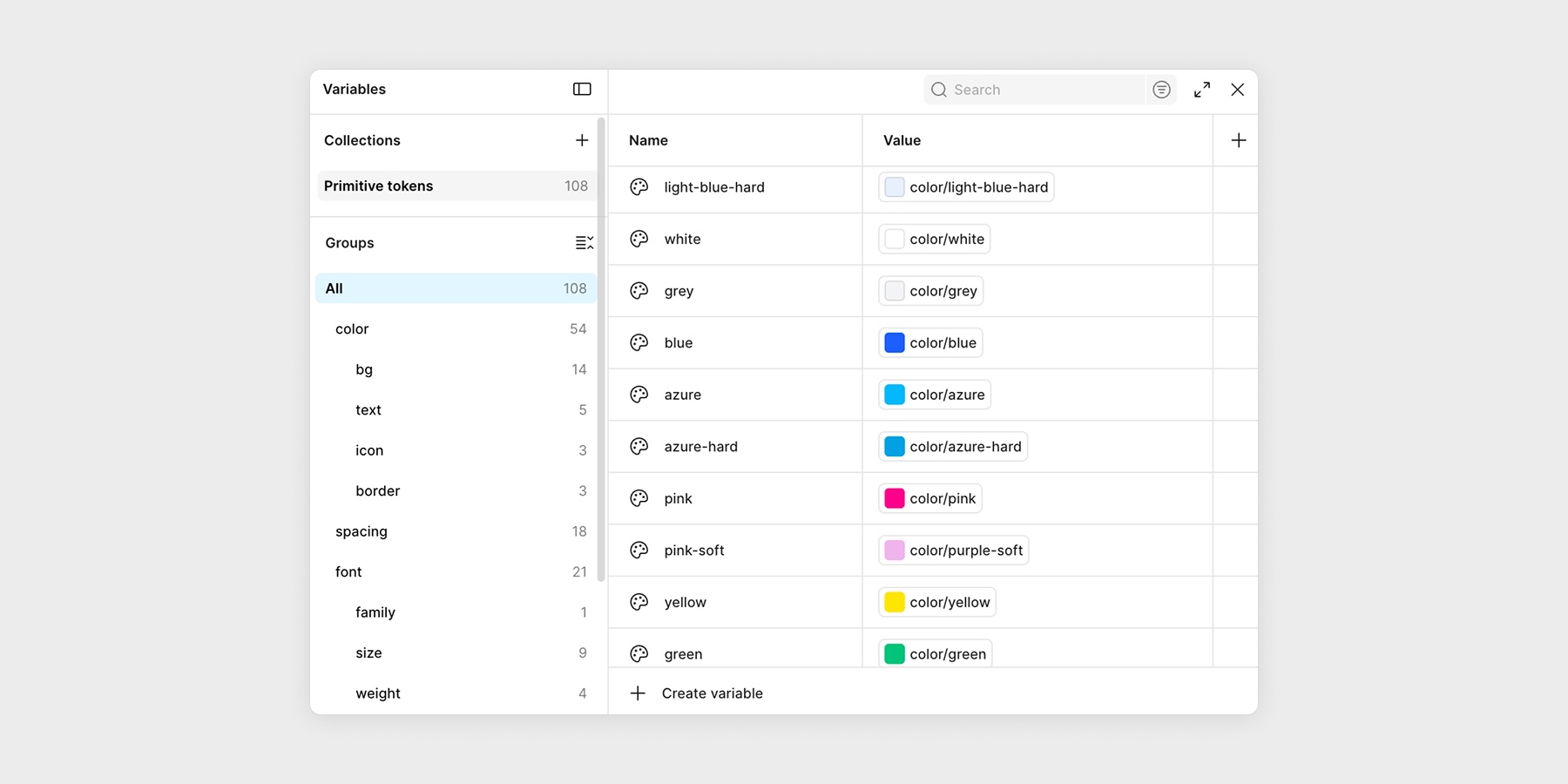
Variables on Figma
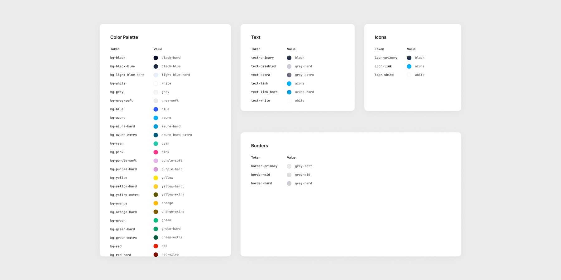
Color variants for elements
Design
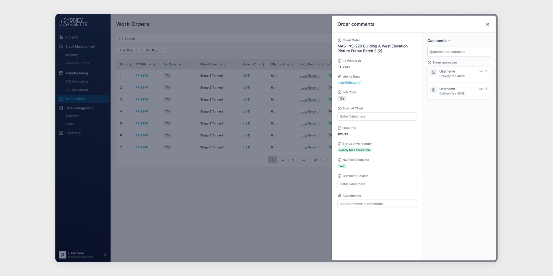
Every element was redesigned to improve the overall experience and reduce cognitive load. Since nearly every page contains tables with large amounts of data, I focused on making that data easier to read and navigate.
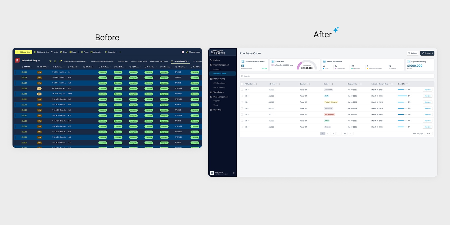
Redesigned the whole app's layout
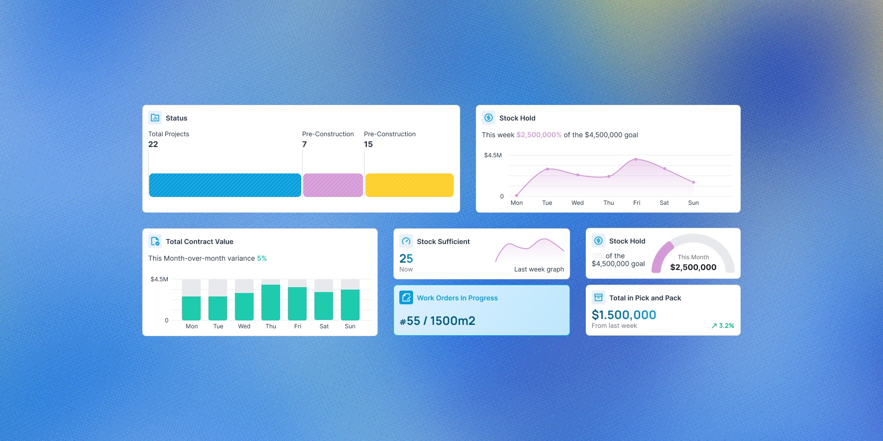
Charts variants on pages
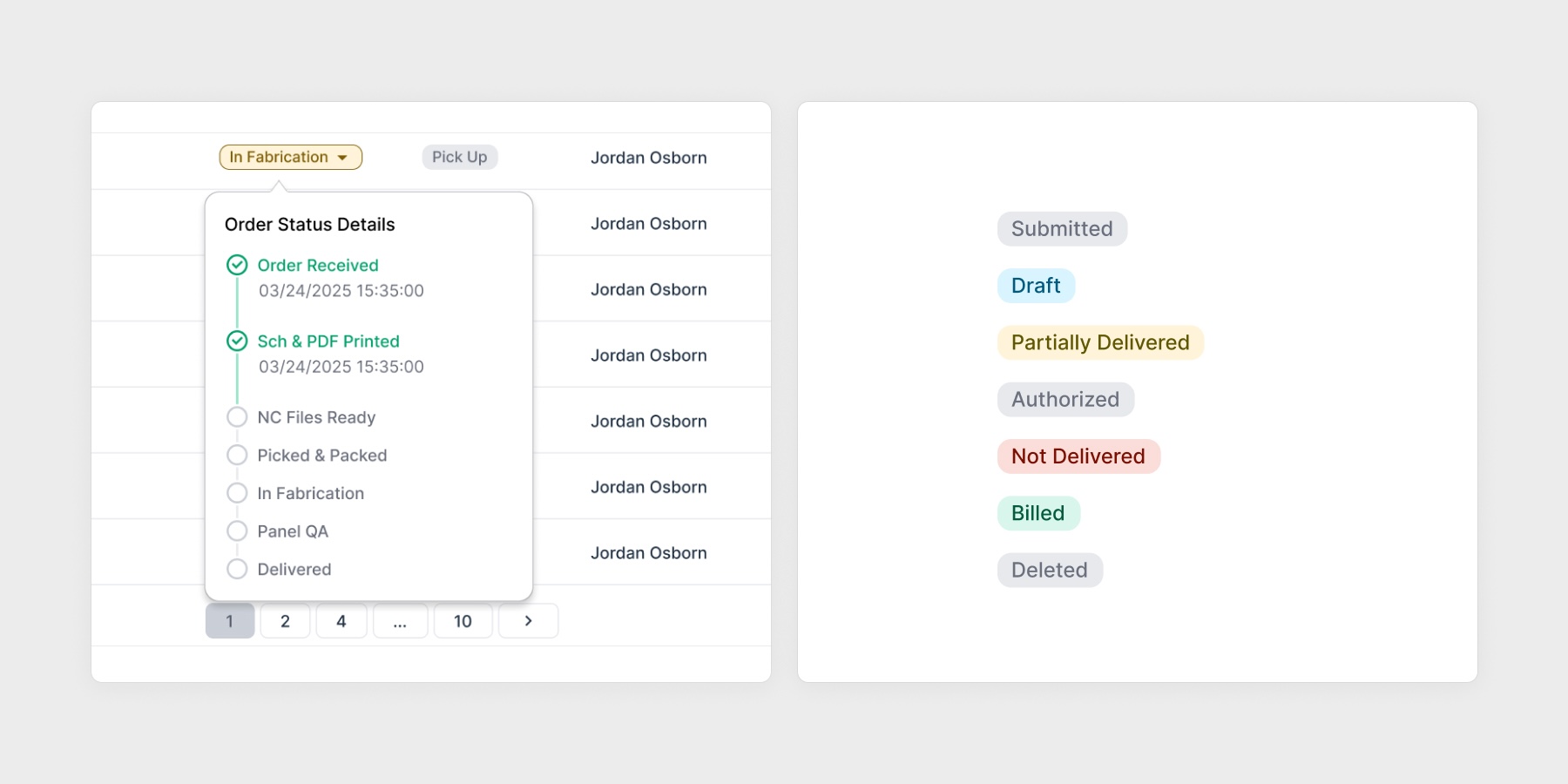
Each component has its own tailored design, carefully considered.
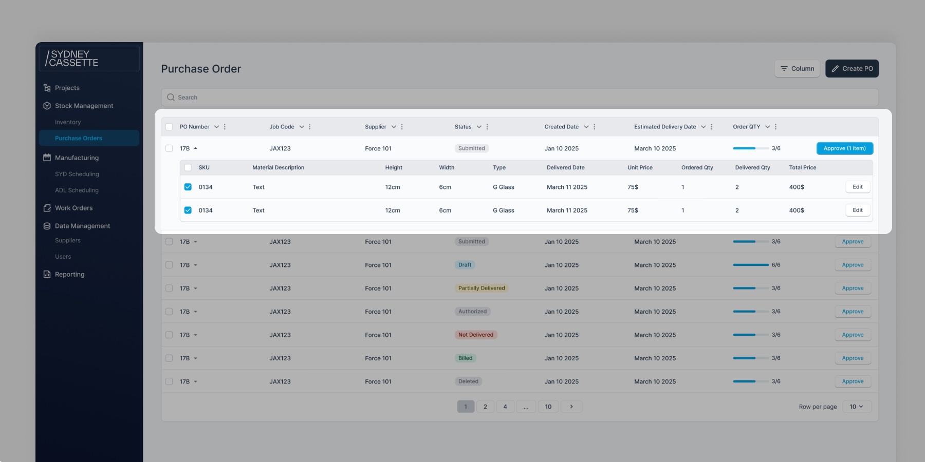
Nested tables in a table.
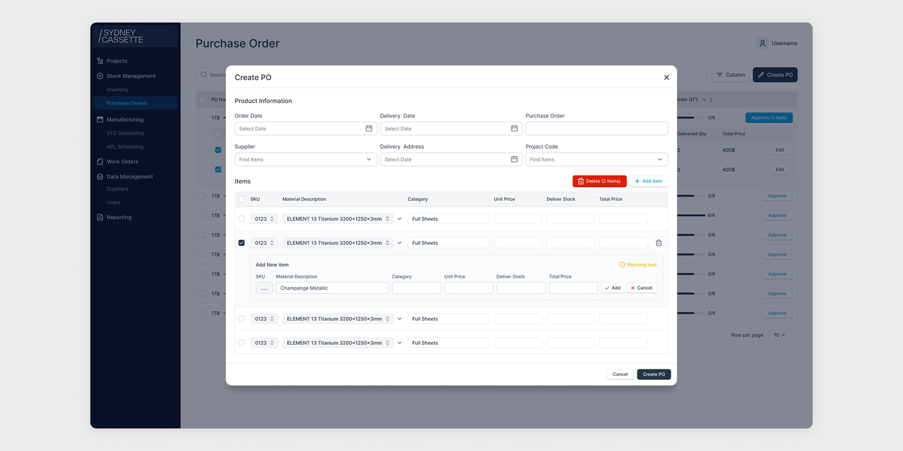
Nested tables in modular components too.
I had a great time working on this project. As the design lead, I learned an incredible amount, from designing within real constraints to reworking the product from the ground up. I learned how to organize large amounts of data on the page so it's easy to see and use without friction. I'm grateful to everyone who discussed and brainstormed with me to solve these problems.