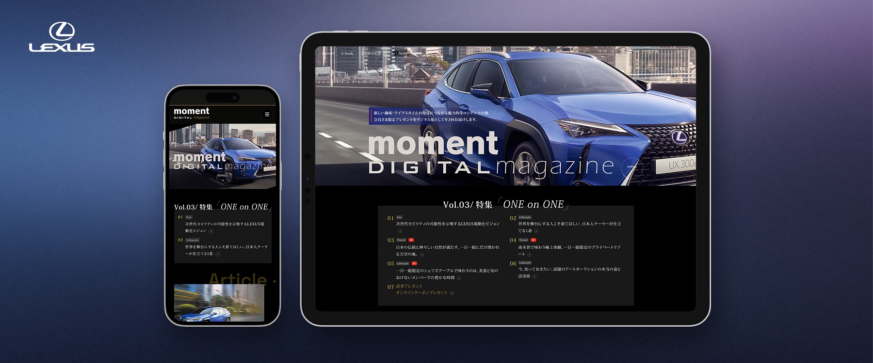
Lexus Membership Digital Magazine
Moment Digital Magazine is an exclusive publication for Lexus Card members, delivering captivating lifestyle content and the latest information to enchant Lexus owners.
Summary
This is a large-scale digital experience with numerous content pages and landing pages. Here, I focus on the initial design process and the decisions that shaped the experience.
Timeline
2021 - 2024
Team
Front-End Engineer, Project Director, Visual/UX Designer (Me)
Tools
Adobe XD, Adobe Photoshop, After Effects, Figjam
Design Principlines
User Centered Design, A/B Testing
My Role
Visual Design, Web Design, Banner Design
The Impact
I led the visual design across the project, from initial concepts and interface design to digital campaign assets.
Goal
Lexus is a luxury automotive brand with a sophisticated customer base. The Lexus Card service provides members with exclusive information, campaigns, and benefits. Approximately 85% of users access the service through smartphones.
Our goal was to create a mobile-first digital experience that combined the editorial feel of a premium magazine with the distinctive visual language of Lexus.
- Designing with a focus on being Mobile-First Ready.
- To convey the impression of a dedicated Lexus feature site used for clients and delight them.
Process
We basically used User Centered Design and A/B Testing to guide the design process and validate key interface decisions.
We first gathered insights into users' backgrounds, behaviors, and daily routines. We then translated those findings into design problems, explored concepts, and iterated on the interface.
Design Iteration
The Analysis and insights
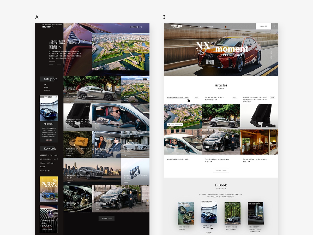
We created two variations of the top page using black and white visual directions, then compared usability and content reachability to identify opportunities for refinement.
Design Challenges
🔲 Too Monochromatic
User testing showed that the interface felt overly restrained, reducing visual energy and making key actions less noticeable and accessible.
😵💫 Messy Pattern
We initially explored a container-free editorial layout to create a distinctive magazine-like experience.
However, the lack of structure made the page harder to scan, caused uncertainty about where to focus, and increased the effort required to reach subsequent content.
Design Solutions
1. Introduced a new accent color
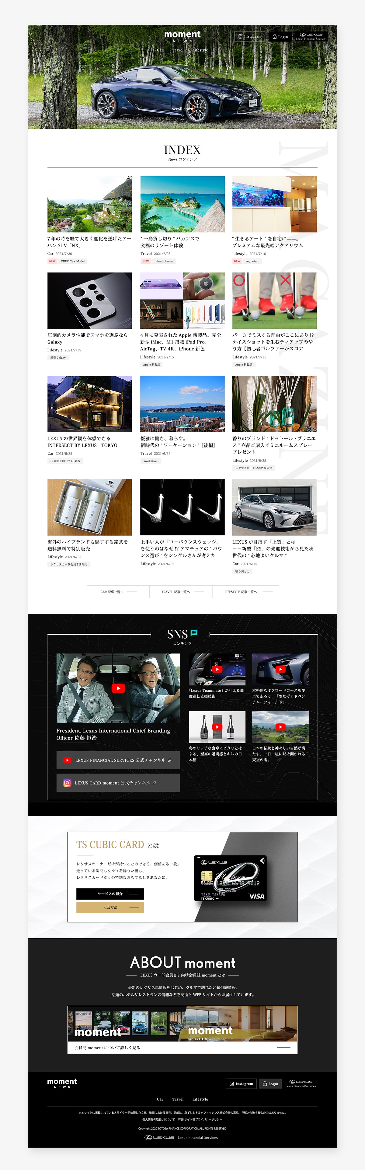
We introduced gold as a refined accent color to reinforce the premium character of the experience. Applying it selectively to interactive elements and highlighted areas created clearer emphasis while adding a sense of exclusivity.

2. Simplified the layout and content hierarchy
We shifted the page to a single-column structure to improve readability, scanning, and content flow. Section titles were centered to create a consistent visual rhythm and clearer separation between content areas. This iteration increased page scrolling and reading speed by 400%, helping users move through a large volume of editorial content more efficiently.
Outcome
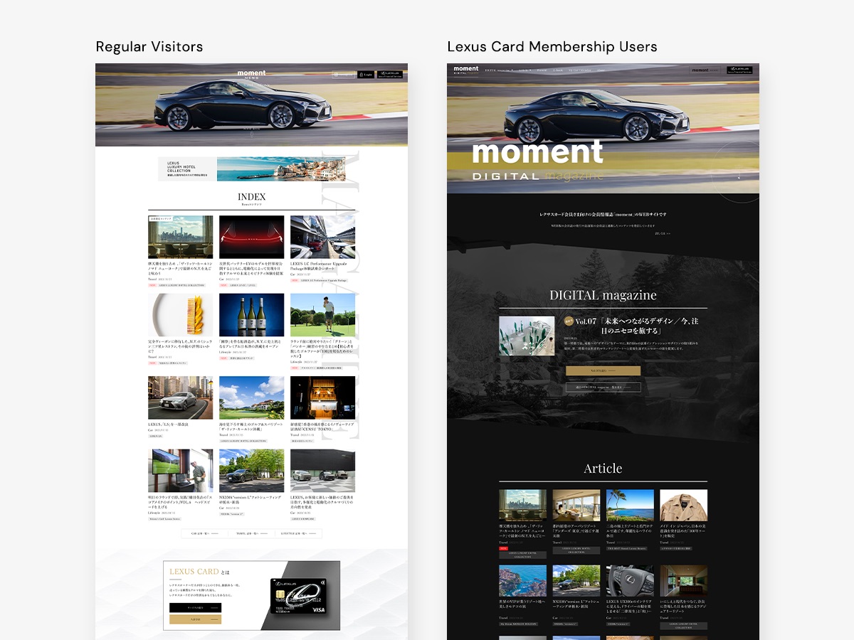
The final experience established a cohesive premium digital magazine platform. The service is currently integrated with thousands of Lexus websites and uses two distinct design languages for logged-in members and regular visitors. This enables members to access more personalized editorial content, along with additional benefits such as exclusive gifts and tailored information.